MoodBoards

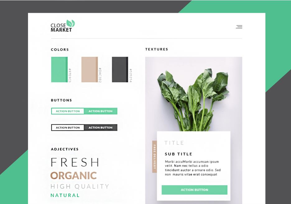
A website moodboard is a visual representation of the overall design direction and aesthetic for a website. It typically includes a collection of images, colors, typography, and other design elements that help to convey the intended look and feel of the website.

The purpose of a website moodboard is to establish a visual direction for the website design and to ensure that all stakeholders involved in the project are aligned on the design aesthetic. It can also serve as a reference for designers as they create mockups and design elements for the website.

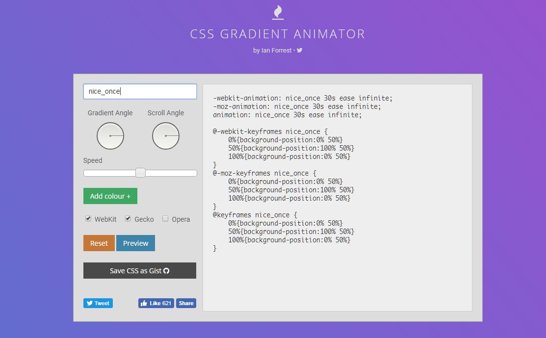
Website moodboards can be created using a variety of tools, including physical collages, digital tools like Canva or Figma, or even Pinterest boards. The key is to gather a collection of images and design elements that capture the desired mood and style for the website

Some easy steps to create a Moodboard

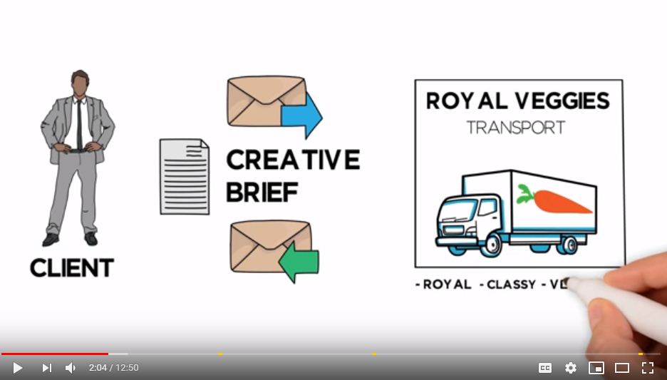
  • Define the purpose and audience: Before you start creating a moodboard, it’s important to understand the purpose of the design project and the target audience. This will help you choose the right images, colors, and other design elements that will appeal to the audience and align with the project goals.
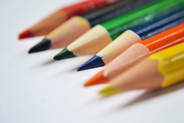
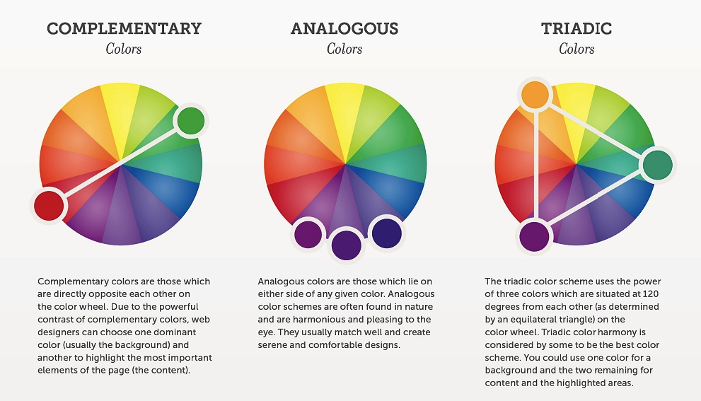
  • Collect inspiration: Gather images, colors, typography, and other design elements that you feel capture the mood and style you want to convey for the website. You can collect these from a variety of sources, including stock photo sites, Pinterest, or your own personal library of images.
  • Choose a format: Decide on the format for your moodboard. You can create a physical collage using magazines and glue, or you can use a digital tool like Canva or Figma to create a digital moodboard.
  • Organize the elements: Arrange the images, colors, and other design elements in a way that makes sense and visually communicates the intended mood and style. You can use different layouts and design principles to achieve this.
  • Refine and edit: Once you have your initial moodboard created, take some time to review it and refine it. Remove any elements that don’t fit or aren’t necessary, and add new elements if needed.
  • Share and gather feedback: Share your moodboard with stakeholders and team members, and gather feedback. Use this feedback to make any final tweaks and adjustments to the moodboard.

you can further get information and ideas from this website URL bellow,

https://www.justinmind.com/blog/mood-board-examples-design-website-app/

Grade 7 ICT Online Test Paper (தமிழ்)

photo : Mohamed Nuzrath (pixabay)

This is a paper I created referring to some Physical Paper, for the students to try and practice, it is in Tamil Medium

தகவல் தொழில்நுட்பம் பரீட்சை தாள் – ஆன்லைன் இல்

Follow this link to do the exam

https://forms.gle/TndYuUQKTjnr4Ffe9

Good Luck

Nuzrath Sir

HTML Cheat Sheet

Hello Everyone,

With this blog post I would like to introduce you a simple yet very powerful and useful feature, an HTML Cheat Sheet – and it’s interactive, and you not only get HTML but also CSS and JS cheat sheets as well, all at one place. you can refer all the various types of html features at a glance, give it a try sure you will like it,

The operation of the site is really intuitive, just highlight a code snippet and copy-paste it in your project. Interact with the panels of the website, try the buttons, sliders or look around in the useful links section!

use the following link to visit the website.

https://htmlcheatsheet.com

Free Icon Pack For Development

social_network_icon_pack_icons_pack_120750

Hi there,

With this post, I would like to introduce you to a website link where you can free of charge download Icon packs for your development works, they have hundreds of packs in different collections, all you have to do is to select the right one and download it to your Computer.

https://all-free-download.com/

Some information from the site as follows;

To Customize Desktop Icons:

License Agreement Says:

These icons are distributed under a Creative Commons Attribution-No Derivative Works 3.0 Unported License.

You are free: to Share — to copy, distribute and transmit the work under the following conditions:

Attribution. You must attribute the work in the manner specified by the author or licensor (but not in any way that suggests that they endorse you or your use of the work).

No Derivative Works. You may not alter, transform, or build upon this work.

For any reuse or distribution, you must make clear to others the license terms of this work. The best way to do this is with a link to the http://creativecommons.org/licenses/by-nd/3.0/ web page.

Any of the above conditions can be waived if you get permission from the copyright holder.

Nothing in this license impairs or restricts the author’s moral rights.

It means the icons are free for personal use and also free for commercial use, but we require linking to our web site. If you don’t want to place a link, purchase them for $199 per set.


Fundamentals of Graphics Design

Hello Every one,

Today am sharing a YouTube video with you all, which discusses the fundamentals of graphics design which is very essential in any design work,

Text Version:

https://edu.gcfglobal.org/en/beginning-graphic-design/fundamentals-of-design/1/

This video includes information on the main elements of art and design, including:

• Line
• Shape
• Form
• Texture
• Balance
• The rule of thirds

Good Luck,

Mohamed Nuzrath.

View the 3rd Video of this play list.

(give them a thumbs up and subscribe and share)

Color Matching Theory

website-color-palettes-4.png

Hello Everyone,

It’s often challenging when you attempt a new web project or logo design or any design related work, and to be able to come up with stunning colors. It’s not a magic you can master the art by carefully learning the basics of color theory,

Today am introducing you a YouTube video on how the color matching theory works and a web URL where you can learn in detail how to use color and what types of colors are available such as dominant color and accent colors etc,

Please follow the URLs.

Color Matching Theory Youtube Video :

https://www.youtube.com/watch?v=_2LLXnUdUIc

Color matching theory website and related resources :

https://www.colormatters.com/color-and-design/basic-color-theory

https://www.websitebuilderexpert.com/how-to-choose-color-for-your-website/

Good luck with your projects

Mohamed Nuzrath

Animated Background with CSS

temp

Hi everyone,

Today I would like to share a website URL with you all which I came across and found it useful for animating backgrounds of a web page using CSS code, the thing is you don’t even need to code a single line of CSS, the code will be auto generated, Just copy and paste it to your web application and you are done. give it a try and tell your comments and suggessts in the comments sections,

https://www.gradient-animator.com/

Have a nice day.

Nuzrath Sir,


LayerSlider – Responsive jQuery Slider Plugin

LayerSlider is the most advanced Responsive jQuery Slider Plugin with the famous Parallax Effect and 3D Transitions! You can use LayerSlider to create a breathtaking Image Slideshow, Banner Rotator or Content Slider to your site!

Features

  • Over 200 breathtaking 2D & 3D hardware accelerated transitions with transition gallery!
  • Transition gallery and option to create your own custom transitions!
  • 5 displaying modes (normal, responsive, full-width, full-width + responsive & full-width + responsiveUnder. Smart resizing and repositioning image, video and also text sublayers in responsive modes including font-sizes, line-heights, etc.)
  • Tons of (mostly unique) features (auto-play and auto-preview images for YouTube and Vimeo videos, auto-pause slideshow if videos are playing, pause on hover, image preload, loops, linking sublayers to another layer or to any url, yourLogo feature with link, deep-linking, random start, random-slideshow, etc.)
  • Unlimited types of usage (image slider, image slider with text, content slider, video gallery slider, mixed content slider, etc…)
  • 3 types of navigation controls (thumbnail mode, hover thumbnails with buttons & buttons only) with auto hide feature
  • Unlimited variations of hardware accelerated animations (sliding from / to 4 directions or fading in / out (sublayers only) with countless easing types, optional rotation and scaling, and sublayers can slide or fade out before other sublayers appear)
  • Use with ANY HTML content (including images, embedded videos, text, forms, flash content and anything you need!)
  • Supports all major browsers (including IE7)
  • Skin editor
  • Sample sliders included
  • Touch-control for mobile devices
  • Keyboard navigation
  • Built-in powerful API
  • Multiple sliders on one page
  • Very detailed documentation
  • SEO friendly
  • Skin support with 12 skins
  • Layered skin files included in .PSD format
  • Free support and future updates

Requirements

Because this is a jQuery plugin, you’ll need jQuery and jQuery Easing JS or jQuery’s UI’s Effects Core to run it.

  • jQuery 1.7+ (important: due to a jQuery bug, required version 1.7 or newer), compatible with jQuery 1.9
  • jQuery Easing JS (included) or jQuery UI Effects Core
  • a modified version of jQuery Transit JS (included) to the new transitions
  • recommended: valid xHTML or HTML 5 markup with DOCTYPE

Download it from

Download the .zip now it Now.! [1.28 MB]

Official Website

http://sachinchoolur.github.io/lightslider/


Mohamed Nuzrath,
2018-07-24

Responsive Web Design without any Frameworks,

responsive_grid_system

Hello Dear Students,

In this blog post I would like to discuss something related to web design, we all know that we use front end frameworks such as Bootstrap
for ease of responsive design, but all the websites and applications that require a responsive design should it be done using such a framework (i.e., Bootstrap) answer is No, and the reason is that when you use such a framework you are bound to use the libraries which come with the framework and whether you like it or now all the library files need to be downloaded and distributed to your clients when they want to render the webpage in their devices, further all the file and libraries which comes with the framework will not be used or useful for your purpose,
Therefore in this blog post I would like to introduce you to a easy flexible way of creating a responsive website without using such frameworks,
Use the website www.responsivegridsystem.com

You can customize it according to your preference and the code will be generated, then copy paste the code to your website, that’s it you are done.
Good luck


Blog at WordPress.com.

Up ↑